I wanted to do a little post about the current trends in anime art direction. Many of the big studios mass-produce several series a season, and like their American live-action counterparts, they tend to all look the same. They're nice-looking, clean and functional; but nothing stands out or is memorable about them. Places like Bones and A-1 Studios make series that are easy on the eyes, but the art direction rarely stands out from the crowd. However, smaller studios like Silver Link and SHAFT (the one I will be referencing here) have smaller budgets, and thus can't afford the full, lush animations that big studios give series and have to get creative to tell their stories. And Bakemonogatari, by SHAFT, might be one of the most interesting-looking animes ever made.


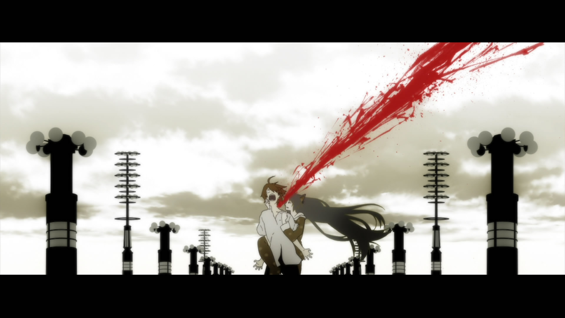
First thing you will notice about Bakemonogatari is how simple it looks. It lacks much of the detail you tend to see in current anime, often using silhouette and solid color to fill out foregrounds, backgrounds, and even character models. Much is made of colors and palette swaps, and heavy use of spotlight and shadow to focus the viewer and depict moods and developments. Many scenes have static environmental shots interspersed with exposition, showing us physical objects that correlate to the subtext of the scene versus just the character's faces as they speak. Aspect ratio gets played with quite a bit to change the tone of a scene. Often times, there are just blank cells with the scene or animation number, and what is "supposed" to be animated there. There are rapid fire scenes of just printed words that can be interpreted as internal monologues of characters or backstory that are lightning fast. There are even highly stylized live-action scenes edited in. It all helps add to the sense of unease and "weirdness" of the show.
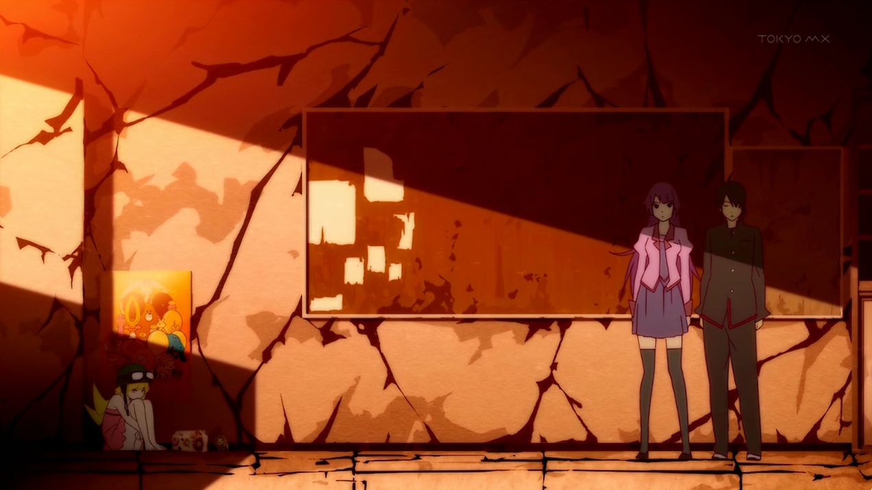

Given that Bakemonogatari is a story about ghosts, vampires, demons, Gods, curses, and powers, these choices in the art direction make sense. The muted tones, stark lighting, and abundant "off-ness" of some of the scenes (characters will often be animated standing in a different place each cut, closer or farther away from other characters depending on their words or tone) can make the viewer question everything they are seeing. It causes us as the audience to become a bit of an unreliable narrator, because there are very few "rules" when it comes to the supernatural, and this show like to play with all of them. When characters reveal things we've been seeing aren't there, or don't mean what we thought they mean, accompanied by unusual shot composition and framing, it disorients you and keeps you from guessing where the story is headed next.


SHAFT, and lead director Akiyuki Shinbo in particular is known for having this very unique and stylish look to their series. Bakemonogatari is one of the prime examples of their "style," and to date the entire Monogatari series has been their biggest claim to fame, but they are also well-known and beloved for their work on Puella Magi Madoka Magica. And, I think, in the end, because of SHAFT's limited size and budgets, it forces them to be so much more creative in their process, and rather than just animating everything the same, at a "higher quality." Their work is instantly recognizable and much, much more interesting to watch than another generic shonen series with "pretty" fights and perfectly-drawn backgrounds. Sometimes, less is more; and every once in a while, less can even be a feast.